library(tidyverse)
library(viridis)
library(usmap)

yearly_rates_joined <- read_csv("data/yearly_rates_joined.csv")

region_summary <- read_csv("data/region_summary.csv")Data Visualization with ggplot2
Learning Objectives
- Become familiar with the components of a
ggplot2graph (i.e. the grammar of graphics) - Use best practices for different graph types
- Understand how to use visualizations to tell a data story
Getting set up
- Go to
File > New Project - In
Create project frommenu chooseExisting Directory - Browse to
Desktop > Session02_DataVisualization - Select the check box that says
Open in New Session - Open the companion script called
02-DataVisualization.R - Use the
library()function to load thetidyverse,viridis, andusmappackages. - Use the
read_csv()function to import theyearly_rates_joinedand theregion_summarycsv files.
Follow Along at Home
Posit (RStudio) Cloud is a browser-based version of RStudio. It will allow you to use RStudio without needing to download anything to your computer. Posit Cloud automatically organizes things into Projects. You can also easily share your R projects with others.
Get Started:
- Create your free RStudio Cloud account at https://posit.cloud/plans/free if you haven’t already.
- Go to the class project https://posit.cloud/content/8458074
- Note the text that marks this as a Temporary Copy. Select the
Save a Permanent Copybutton to begin working!
Why Data Visualization?
Visualization is an important process which can help us explore, understand, analyze, and communicate about data. Visualizations, including many kinds of graphs, charts, maps, animations, and infographics, can be far more effective at quickly communicating important points than raw numbers alone. But visualizations also have the power to mislead. And so throughout this class, we’ll be covering some good data visualization practices. Slides accompanying this section can be found here: https://osf.io/yk5bx1
The Data for This Lesson
In this lesson, we will continue to use the measles data we were working with in the Data Wrangling lesson. By the end of that lesson, we had joined our measles tibble with another tibble of population data. This enabled us to calculate the incidence rate of measles in each state and each year. We also combined that data with the states tibble so we could look at regional and division trends as well.
ggplot2 Basics
Next, we will learn about ggplot2 - a tidyverse package for visualizing data. It is a powerful and flexible R package that allows you to create fully customizable, publication quality graphics. The gg in ggplot2 stands for grammar of graphics. The grammar of graphics is the underlying philosophy of the package. It focuses on creating graphics in layers. Start with the data
All ggplot2 graphs start with the same basic template:
<DATA> %>%
    ggplot(aes(<MAPPINGS>)) +
    <GEOM_FUNCTION>() +
    <Additional GEOMS, SCALES, THEMES, etc. . . >
All graphs start with the ggplot function and the data. We
region_summary %>%
  ggplot()
We see that even this initializes the plot area of RStudio.
Next, we define a mapping (using the aesthetic, or aes(), function), by selecting the variables to be plotted and specifying how to present them in the graph, e.g. as x/y positions or characteristics such as size, shape, color, etc. Here we will say that the x axis should contain the affiliation variable. Note how the x-axis populates with some numbers and tick marks.
region_summary %>%
  ggplot(aes(x=region, y=avg_rate))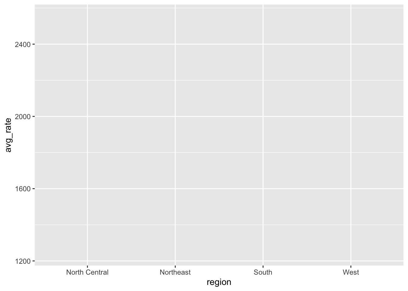
Next we need to add <e2><80><98>geoms<e2><80><99> ggplot2 offers many different geoms for common graph types. To add a geom to the plot use the + operator.
region_summary %>%
  ggplot(aes(x=region, y=avg_rate)) +
           geom_bar(stat = "identity")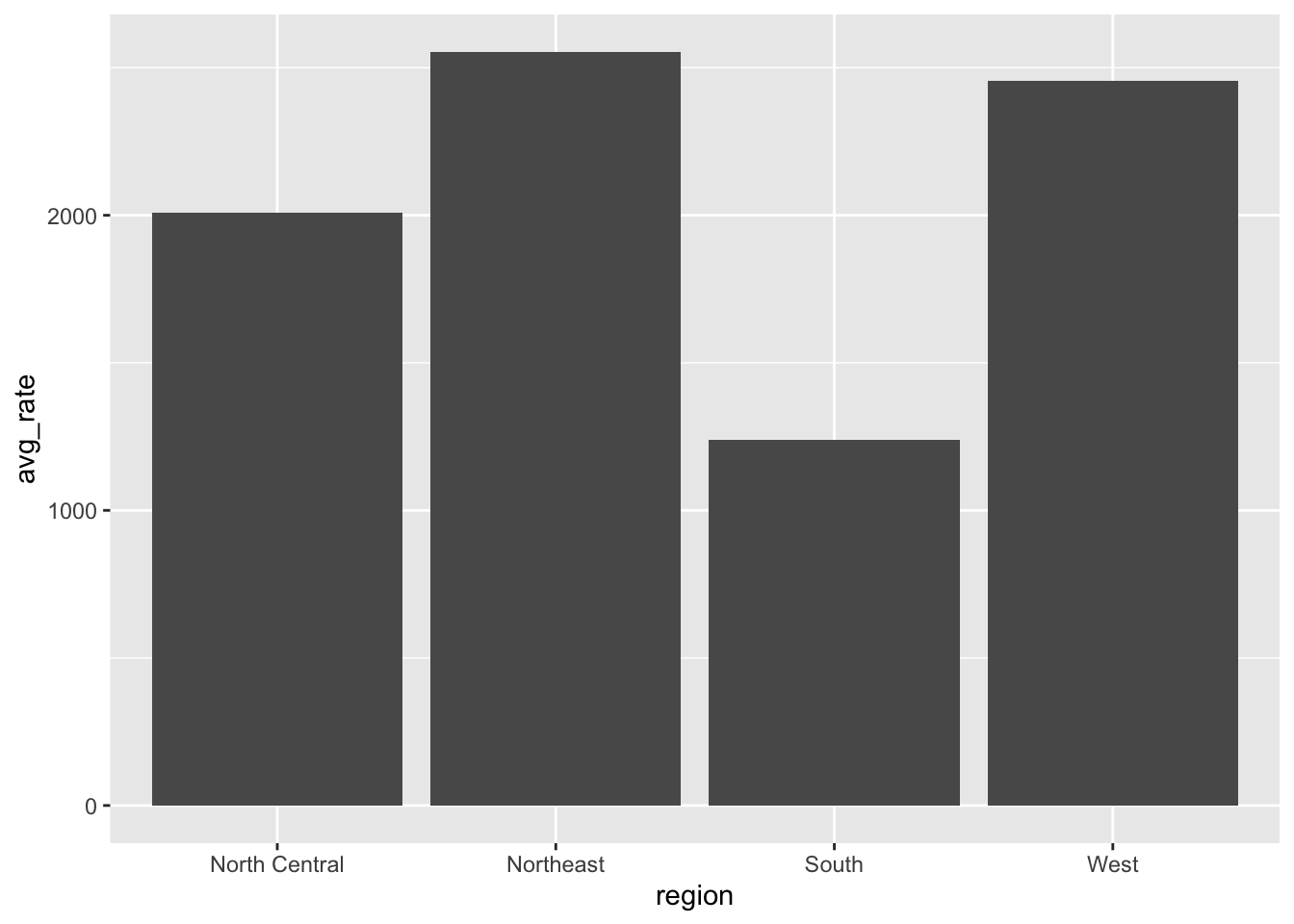
If you want the y axis to display something other than count, you need to make a couple of small adjustments. First - specify the y variable in the aes() function, and change the stat argument from it
Setting vs mapping aesthetics
When working with ggplot2, it’s important to understand the difference between setting aesthetic properties and mapping them. All geoms have certain visual attributes that can be modified. Polygons like bars, have the properties fill and color. You can change the inside color of a bar with fill, and the border with color. We can modify the defaults with the fill and color arguments in the geom_bar() layer. (I’ve also increased the linewidth to make it easier to see the border color)
region_summary %>%
  ggplot(aes(x=region, y=avg_rate)) +
           geom_bar(stat = "identity",
                    fill="blue",
                    color="purple",
                    linewidth=1.5,
                    width = 0.8)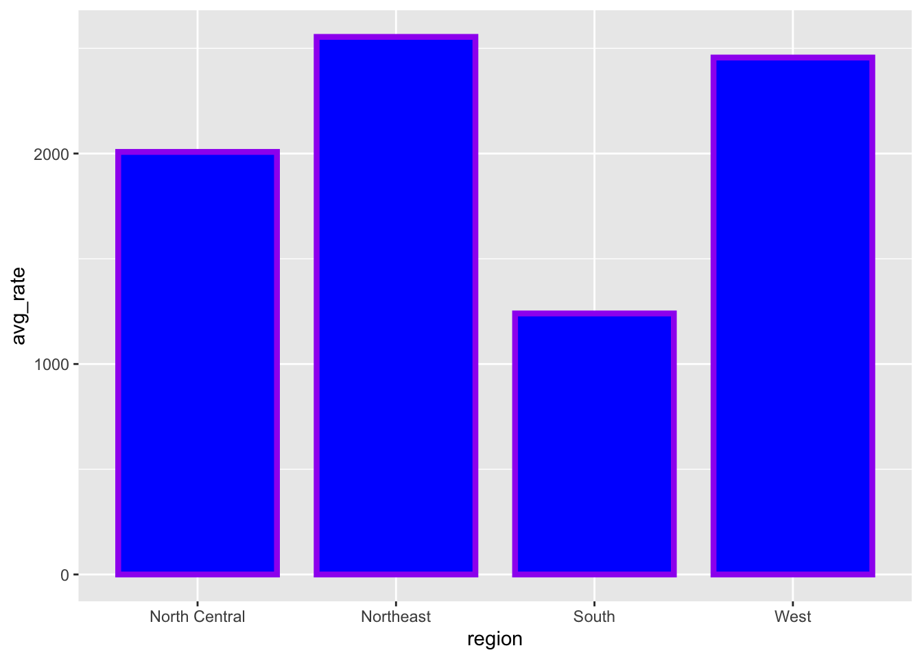
Note
How did we know the color names “blue” and “purple” would work in the code above? R has 657 (!!) built in color names. You can see them by calling the function colors(). You can also specify colors using rgb and hexadecimal codes.
Now we have manually set a value for the fill and color. To create our initial graph, we used the mapping argument and the aes() function to map the x axis to the region variable. Watch what happens if we map the fill property to the region variable as well.
region_summary %>%
  ggplot(aes(x=region, y=avg_rate, fill=region)) +
           geom_bar(stat = "identity")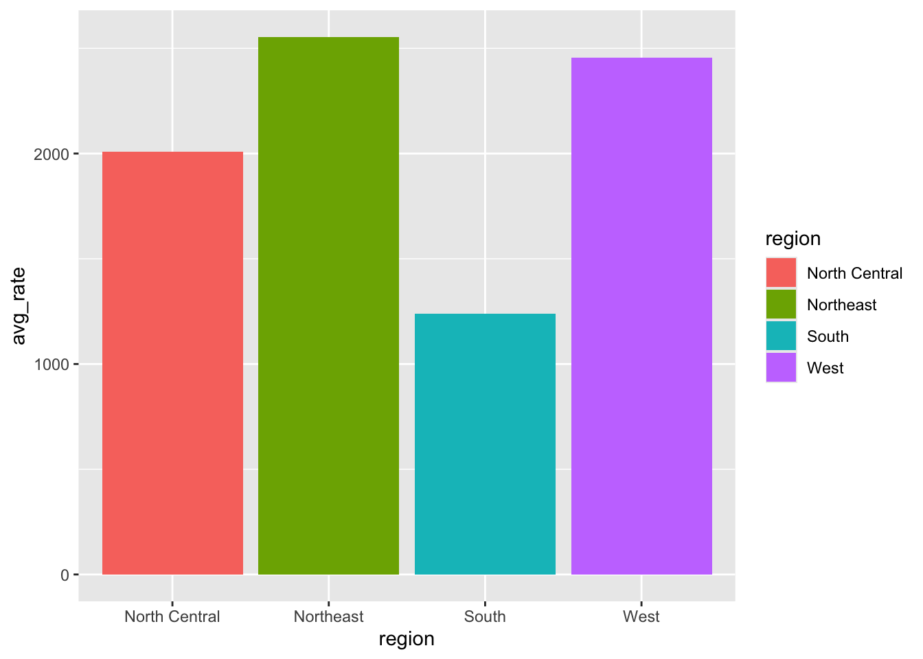
As we’ll see later in this lesson, mapping a variable to an aesthetic will be especially helpful when we have a third variable to display.
Note
When you map an aesthetic with aes() in the ggplot() function it is inherited by all subsequent layers. When you map in a geom_*() function it is applied only to that layer.
Telling a data story
Now let’s start using ggplot2 to help us answer our research question - how did the introduction of the vaccine affect measles rates in the country? We’ll do this with a line graph, which is useful for showing change over time.
First, we need to use our **dplyr** skills to summarize the data.
yearly_count <- yearly_rates_joined %>%
  group_by(Year) %>%
  summarize(TotalCount = sum(TotalCount))
We pipe to ggplot() and assign Year to the x-axis and TotalCount to the y-axis with the aes() function. The canvas and axes are ready.
yearly_count %>%
  ggplot(aes(x=Year, y=TotalCount))
Now we can add a geom layer to add our line. Let’s also be sure to save our work to an object.
yearly_count %>%
  ggplot(aes(x=Year, y=TotalCount)) +
  geom_line()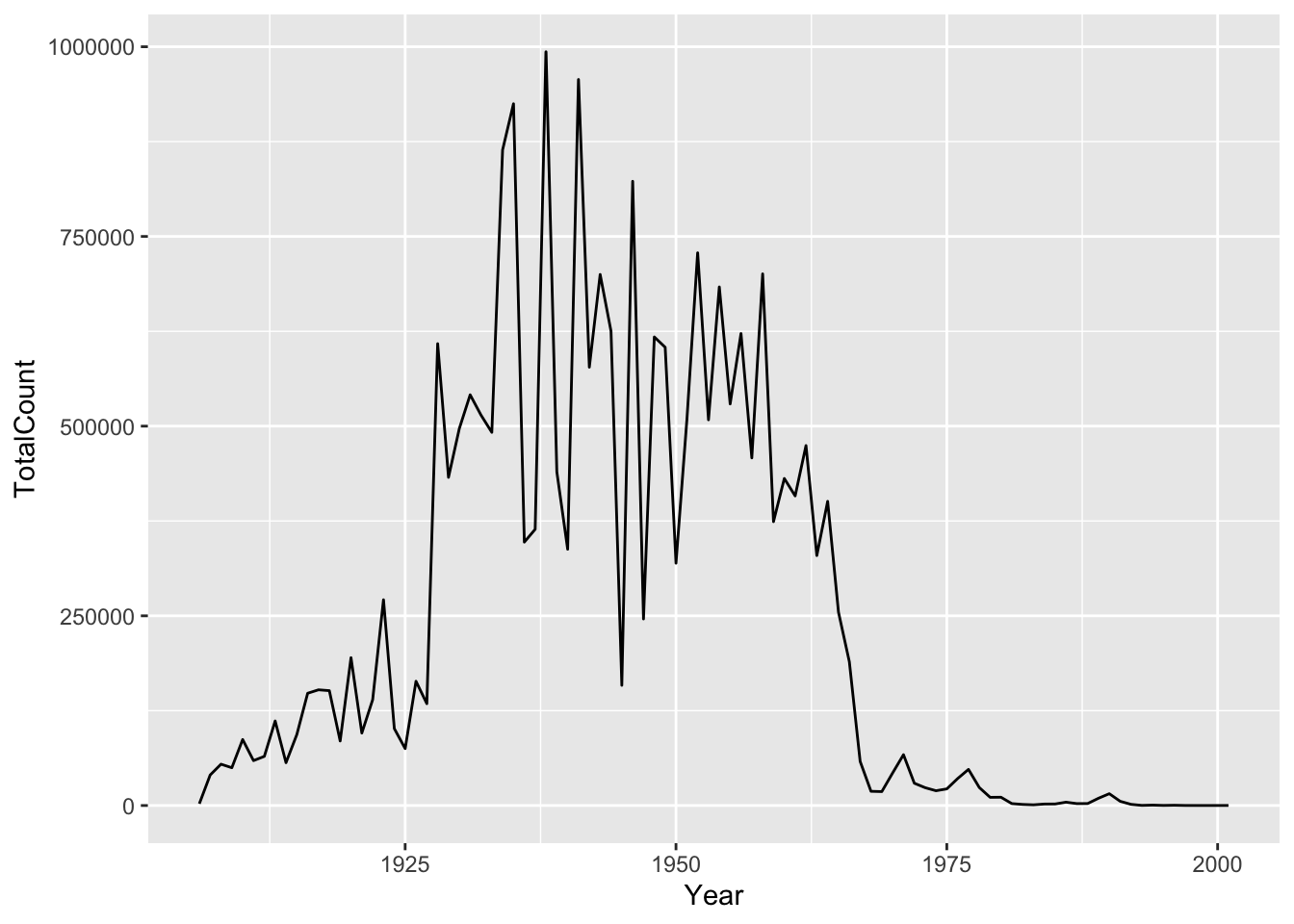
It might be nice to see where each data point falls on the line. To do this we can add another geometry layer.
yearly_count %>%
  ggplot(aes(x=Year, y=TotalCount)) +
  geom_line() +
  geom_point()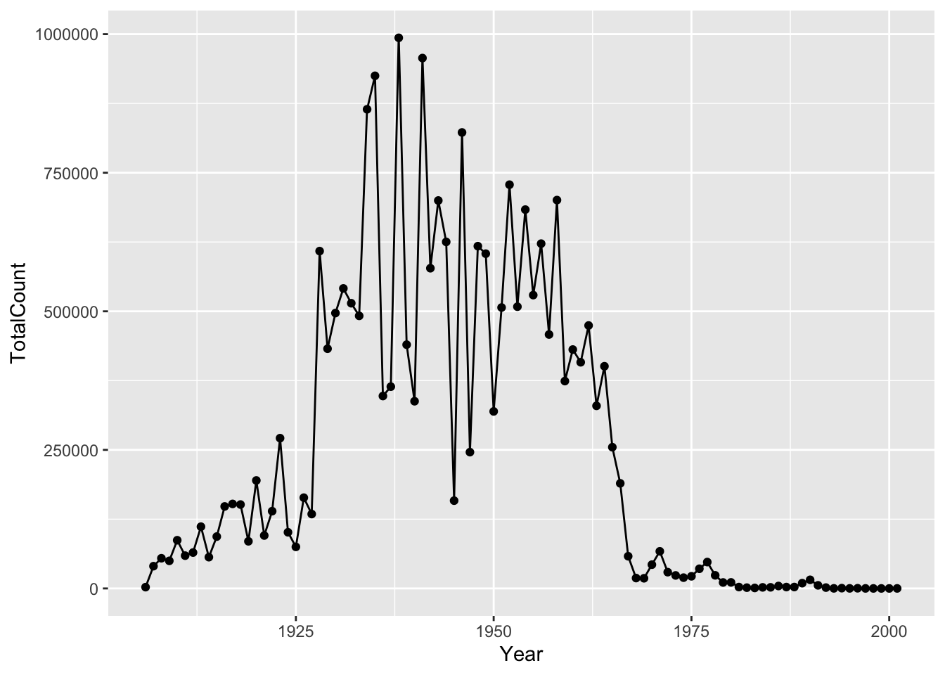
There are many ways to customize your plot, like changing the color or line type, adding labels and annotations. One thing that would make our graph easier to read is tick marks at each decade on the x-axis. There are a number of functions in ggplot2 for altering the scale. We want to alter the x-axis scale, which holds continuous data, so we can use the scale_x_continuous() function. Note that when you start to write the name of the function, RStudio will supply you with other similarly named functions.
scale_x_continuous() has an argument called breaks which allows you to alter where the axis tick marks occur. We can use that together with seq() to say put a tick mark every 10 places between 1900 and 2000.
yearly_count  %>%
  ggplot(aes(x=Year, y=TotalCount)) +
  geom_line() +
  geom_point() +
  scale_x_continuous(breaks = seq(from=1900, to=2000, by=10))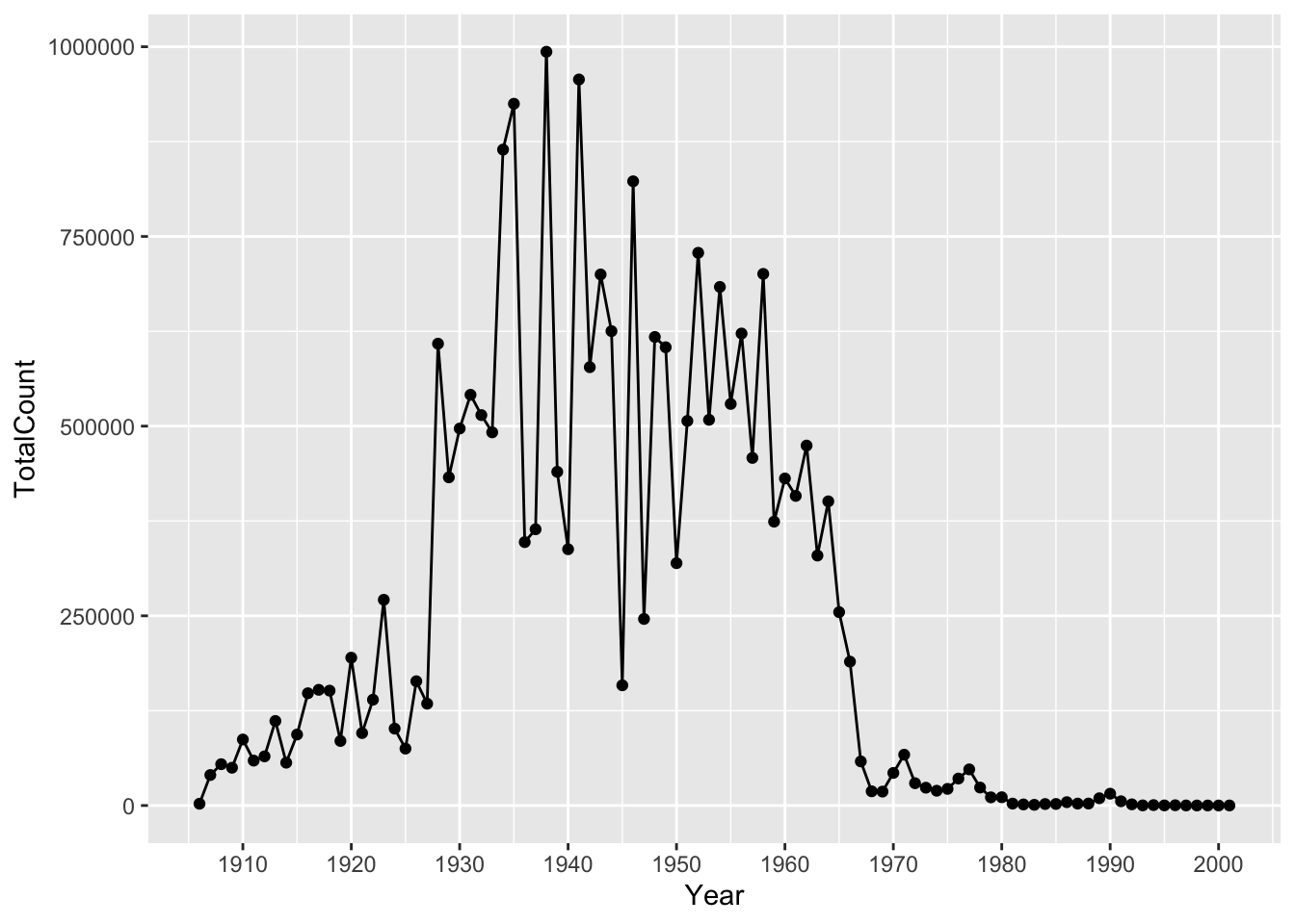
Now we can move beyond basic exploration and start to use our graph to analyze and tell stories about our data. One important trend we might notice, is the sharp decrease in cases in the 1960s. The measles vaccine was introduced in 1963. We can use our visualization to tell the story of the vaccine’s impact.
Let’s drop a reference line at 1963 to clearly indicate on the graph when the vaccine was introduced. To do this we add a geom_vline() and the annotate() function. There are multiple ways of adding lines and text to a plot, but these will serve us well for this case. Note that you can change features of lines such as color, type, and size. We can supply coordinates to annotate() to position the annotation where we want.
yearly_count %>%
  ggplot(aes(x=Year, y=TotalCount)) +
  geom_line() +
  geom_point() +
  scale_x_continuous(breaks = seq(from=1900, to=2000, by=10)) +
  geom_vline(xintercept = 1963, color = "red", linetype= "dashed") +
  annotate(geom = "label", x=1963, y=800000, label="1963: vaccine introduced")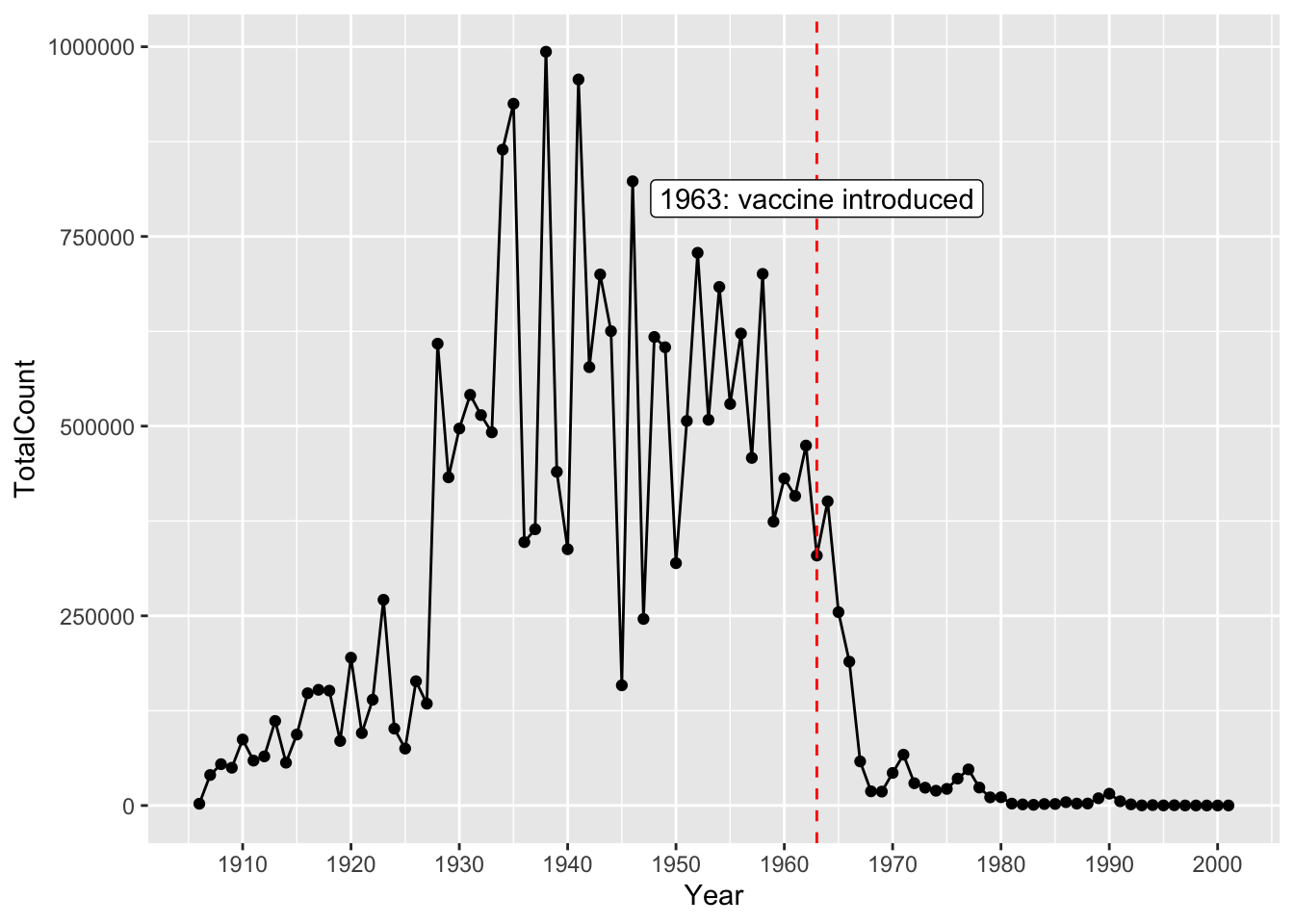
Finally, let’s add a title and axis labels to our plot with the labs() function. Note that axis labels will automatically be supplied from the column names, but you can use this function to override those defaults.
yearly_count_line <- yearly_count %>%
  ggplot(aes(x=Year, y=TotalCount)) +
  geom_line() +
  geom_point() +
  scale_x_continuous(breaks = seq(from=1900, to=2000, by=10)) +
  geom_vline(xintercept = 1963, color = "red", linetype= "dashed") +
  annotate(geom = "label", x=1963, y=800000, label="1963: vaccine introduced") +
  labs(title = "Measles Cases Decrease After Vaccine Introduced", x = "Year", y = "Total Measles Case Count")
Now, we have a pretty nice looking graph. Finally, let’s save our plot to a png file, so we can share it or put it in reports. To do this we use the function called ggsave().
ggsave("figures/yearly_measles_count.png", plot = yearly_count_line)Working with Three Variables
If we have different groups in our data, we might want to use the graph to compare them. Let’s create another line graph with a line for each region. Since the regions are different sizes, let’s compare the average rate instead of the total count.
First, let’s summarize our data
regional_rates <- yearly_rates_joined %>%
group_by(Year, region) %>%
summarize(avg_rate = mean(epi_rate, na.rm=TRUE))
regional_rates %>%
ggplot(aes(x=Year, y=avg_rate, group=region, color=region)) +
geom_line()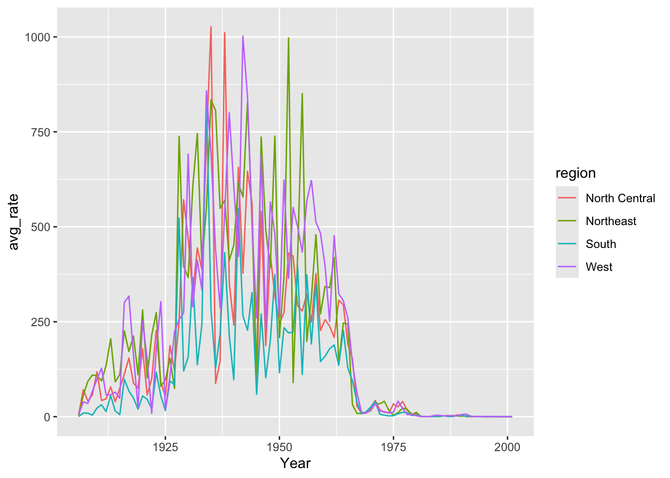
Working with color palettes
While ggplot comes with a default color palette, there are numerous other palettes out there you can use, such as:
Let
To do this, we need add another scale_ function. This time scale_color_viridis().
regional_rates %>%
  ggplot(aes(x=Year, y=avg_rate, group=region, color=region)) +
  geom_line(linewidth=1) +
  scale_color_viridis(discrete=TRUE)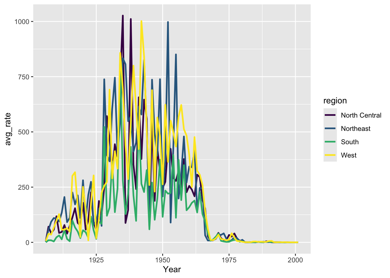
Note
Learn more from the viridis documentation
Let’s adjust tick marks and add labels again
regional_rates %>%
  ggplot(aes(x=Year, y=avg_rate, group=region, color=region)) +
  geom_line(linewidth=1) +
  scale_color_viridis(discrete=TRUE)  +
  scale_x_continuous(breaks = seq(from=1900, to=2000, by=10)) +
  labs(x="", y= "Incidence Rate of measles \n per 100,000 persons", color="Region")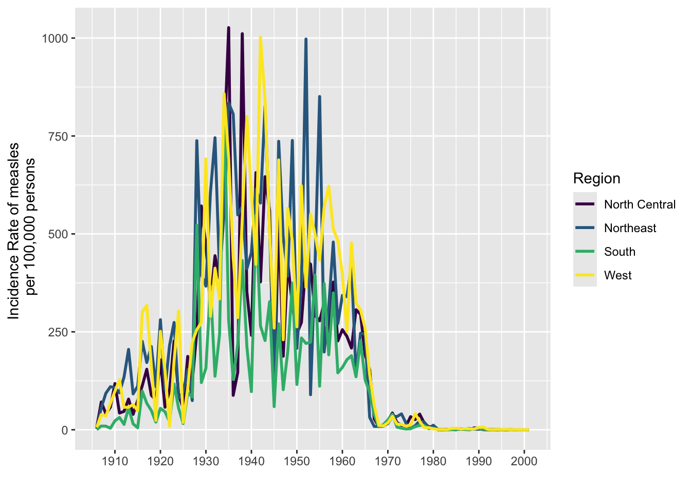
Changing the theme
The theme of a ggplot2 graph controls the overall look and all non-data elements of the plot. There are several built-in themes which can be applied as another layer. Start typing theme_ in RStudio to see a list of themes. You can also use the theme() function to modify aspects of an existing theme. Here we apply theme_classic() which removes the grid lines and grey background of the default theme.
regional_rates %>%
  ggplot(aes(x=Year, y=avg_rate, group=region, color=region)) +
  geom_line(linewidth=1) +
  scale_color_viridis(discrete=TRUE)  +
  scale_x_continuous(breaks = seq(from=1900, to=2000, by=10)) +
  labs(title = "Measles Cases in the 20th Century", x="", y= "Average rate\nper 100,000", color="Region") +
theme_classic()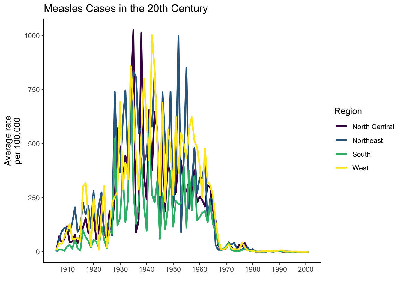
In addition to setting an overall theme, we can tinker with individual elements of a theme with the theme() function. Check out the ggplot2 documentation for all the elements that can be adjusted. Here we are going to make an adjustment to the y axis label. It’s good practice to make as much of your text horizontal as possible for ease of reading.
regional_rates %>%
  ggplot(aes(x=Year, y=avg_rate, group=region, color=region)) +
  geom_line(linewidth=1) +
  scale_color_viridis(discrete=TRUE)  +
  scale_x_continuous(breaks = seq(from=1900, to=2000, by=10)) +
  labs(title = "Measles Cases in the 20th Century", x="", y= "Average rate\nper 100,000", color="Region") +
  theme_classic() +
  theme(axis.title.y = element_text(angle=0, vjust = 0.5, hjust = 0.5))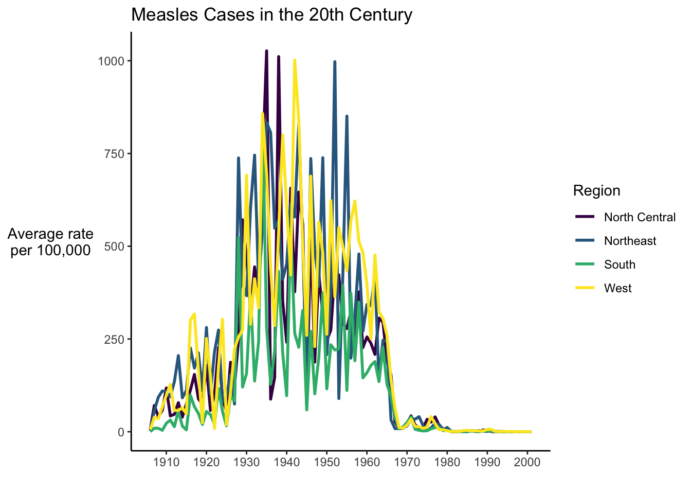
Faceting and Small Multiples
Even with the adjustments we made, it can be difficult to understand a graph with too much data. Even with just five lines it can be hard to see what’s happening. A good practice is to break out each group into individual graphs called small multiples or facets.
regional_rates %>%
  ggplot(aes(x=Year, y=avg_rate, group=region, color=region)) +
  geom_line(linewidth=1) +
  scale_color_viridis(discrete=TRUE)  +
  scale_x_continuous(breaks = seq(from=1900, to=2000, by=10)) +
  labs(title = "Measles Cases in the 20th Century", x="", y= "Average rate\nper 100,000", color="Region") +
  facet_wrap(~region, nrow=2) +
  theme_classic() +
  theme(axis.title.y = element_text(angle=0, vjust = 0.5, hjust = 0.5))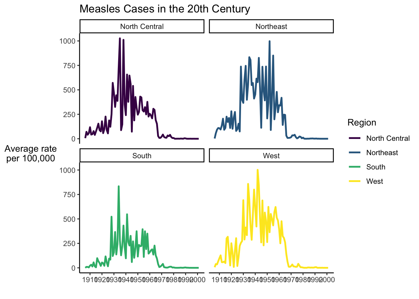
Highlighting
We could also use highlighting to do away with noise in a line graph. Then we can create two geom_line layers and highlight just the one in the facet.
tmp <- regional_rates %>%
  mutate(region2=region)

tmp %>%
  ggplot(aes(x=Year, y=avg_rate)) +
  geom_line(data=tmp %>% dplyr::select(-region), aes(group=region2), color="grey", linewidth=0.5, alpha=0.5) +
  geom_line(aes(color=region), color="#69b3a2", linewidth=1.2 ) +
  scale_x_continuous(breaks = seq(from=1900, to=2000, by=10)) +
 theme_minimal() +
  theme(
    legend.position="none",
    plot.title = element_text(size=14),
    panel.grid = element_blank()
  ) +
  ggtitle("A comparison of measles cases by Region") +
  facet_wrap(~region, ncol = 2)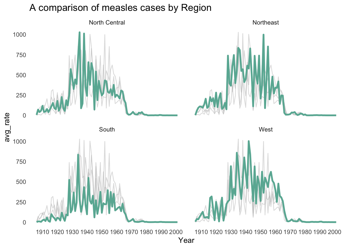
Maps
While we were successful at creating a bar chart to compare measles rates in each state, it is often more helpful to use a map to visualize geographic data. There are multiple types of map-based visualizations in R and tools for creating them. While it is possible to make interactive and animated maps in R, in this lesson, we will only cover static maps.
In this lesson, we will focus on creating choropleths. Despite the funny name, this is a visualization you have likely seen many many times. A choropleth is a map that links geographic areas or boundaries to some numeric variable.
ggplot2 needs a little help to make map visualizations. Depending on the geographies you want to map, you may need to find geoJSON or shapefiles. There are also several packages in R that come pre-loaded with background maps of common geographies. We’ll be using one in this lesson called usmap. There are several advantages to this package:
- It contains maps of the US with both state and county boundaries.
- You can create maps based on census regions and divisions. 3. Alaska and Hawaii are included, while many map packages only have a map of the continental US.
- It creates the map as a
ggplot2object, so you can customize the visualization withggplot2functions (i.e. the things you’ve been learning in this lesson!)
We’ve installed usmap in your RStudio Cloud project, so now let’s load it into our session.
library(usmap)The main function in this package is plot_usmap. When you call it without any arguments, you get the background map of the US.
plot_usmap()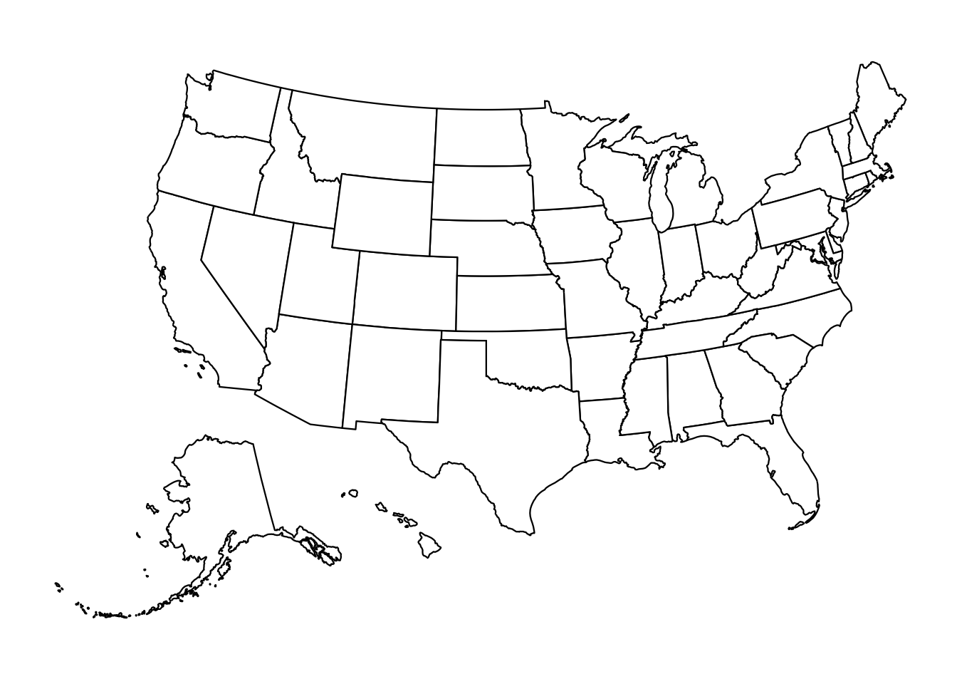
By default it shows state boundaries, but we could also ask it to show county boundaries
plot_usmap(regions="counties")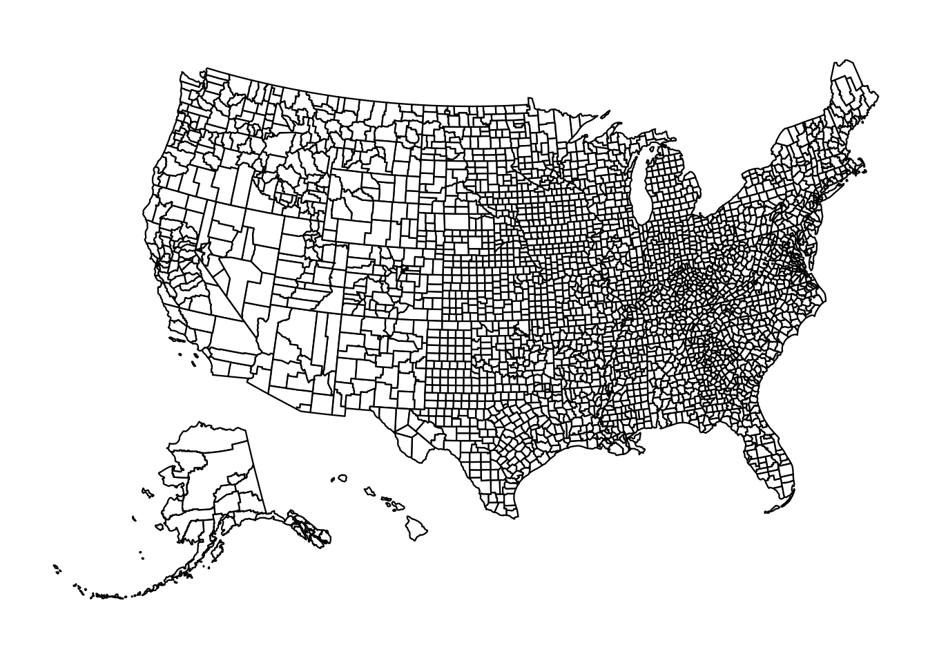
Since we do not have that level of data in our dataset, we’ll use the default option. There are two required arguments to plot_usmap().
- The first is a data frame specified with the
dataargument. This data frame must have a column calledstateorfipswhich contains state names or FIPS (Federal Information Processing) codes. FIPS codes must be used for county level data. This data frame must also have a column of values for each state or FIPS. - The second argument is the name of the column that contains the values, specified by the
valueargument.
Let’s first create a data frame with just our 1963 data.
measles1963df <- yearly_rates_joined %>%
  filter(Year==1963)
Now let’s plot our data with plot_usmap(). Remember it’s important to use rate here rather than our raw count numbers since we are dealing with areas of vastly different populations.
plot_usmap(data=measles1963df, values = "epi_rate")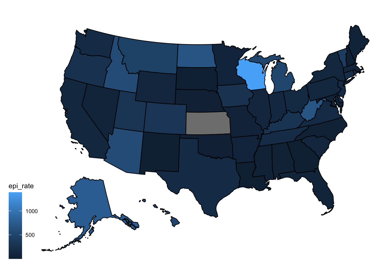
Let’s try with our viridis color palette.
plot_usmap(data=measles1963df, values = "epi_rate") +
  scale_fill_viridis()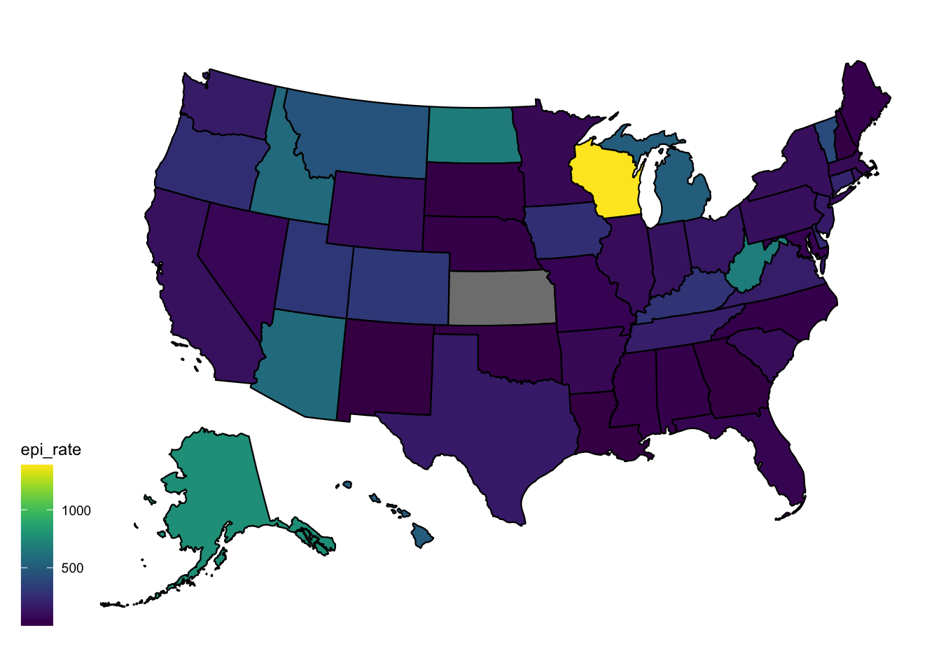
Note how the brighter areas seem to highlight the areas of greater concern.
If you prefer the darker colors to represent higher rates, and lighter to represent lower, we can switch the direction of the palette with the direction argument.
plot_usmap(data=measles1963df, values = "epi_rate") +
  scale_fill_viridis(direction = -1)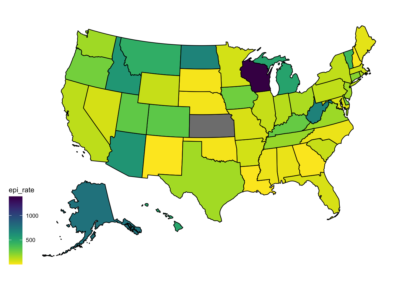
Let’s try another of the viridis palettes.
plot_usmap(data=measles1963df, values = "epi_rate") +
scale_fill_viridis(option = "rocket", direction = -1) 
Let’s add a title, assign to an object, and save to a png file.
map_1963 <- plot_usmap(data=measles1963df, values = "epi_rate") +
  scale_fill_viridis(option = "rocket", direction = -1) +
  labs(title = "Incidence Rate of Measles per 100,000 people in 1963")

ggsave(filename = "figures/map_1963.png", plot = map_1963, bg = "white")
Next Steps: From BeginnR to PractitionR
I hope you enjoyed this very brief introduction to R. You may be wondering - where do you go from here?
There are tons of R classes and tutorials on the internet, but the best way to learn R is to use it! I recommend picking a data set and just playing around. There’s no harm in making mistakes along the way. It’s much easier to find a useful tutorial if you look for ones that teach a specific task you want to accomplish.
Also, check out these helpful resources:
- R for Data Science, by Hadley Wickham
- Tidyverse documentation
- R Graph Gallery
- R Graphics Cookbook
Footnotes
Slides created by the Visualizing the Future project, made possible in part by the Institute of Museum and Library Services, RE-73-18-0059-18.↩︎